Yesterday, I asked for opinions on a jacket I was on the fence about. It's cute in theory, but something was...off. Well, you all agreed with me because I got comments saying the jacket was cute but the fabric was frumpy, looks like something my mother-in-law would wear, and definitely needs some embellishment. I totally agree, and I'm going to see what happens after I add buttons or a waist closure of some sort.
I whipped up another one yesterday (seriously, this pattern is great) and I ask: Is this better? It still needs buttons, but what say you - cute? Or give up on this pattern? I like it so much that I was tempted to make a matching pencil skirt and have a cute little retro suit, but I got a "oh honey, no" from the husband.
It was really bright, so sorry about the squintiness. Man, I need to trim my bangs too.
And the one no one liked. I think it'll be better if I make the jacket edges rounded like I did to the one above. I wish it was cuter because it is really well made and very comfortable. Mike thinks the problem is that the fabric is not jackety, it's more blousey. I still have 5 yards of it, so maybe a blouse is in the cards.
Honest opinions please. My fate as a "jacket person" rests in your hands.

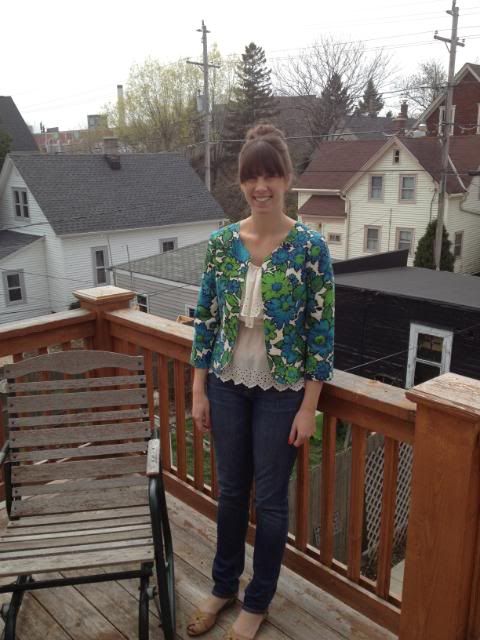
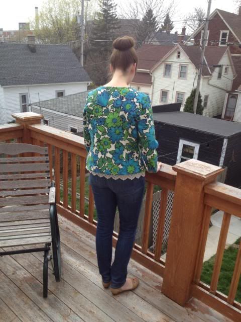
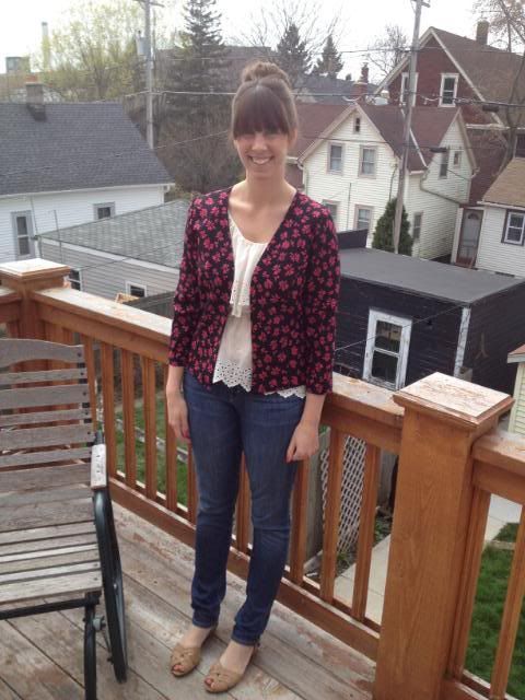
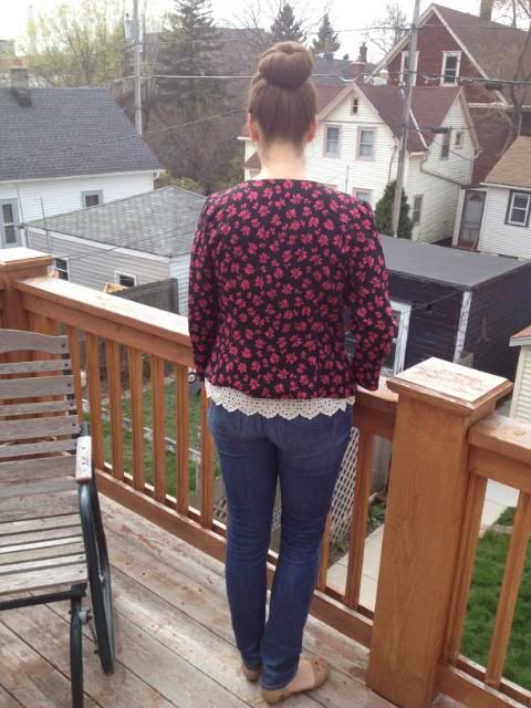

I think the problem is lapels. I think if it had some kind of neck design to it it would look more like a jacket. To me it looks like a great cardigan pattern.
ReplyDeleteIt seems like you are trying to make a jacket that looks and functions as a cardigan rather than a jacket, because the floral patters look like those vintage cardia that came in printed knits.
ReplyDeleteThe shape is nice on you, and you've sewed it very well, but there is something incongruous about the fabric and pattern. The shape suits you and maybe a more traditional fabric choice would give you a more satisfying result? Having said that your second jacket has panache, maybe because the print is bolder and more statementy.
I like this second one better. It definitely is wearable in an outfit like shown.
ReplyDeleteI think the first one is a wadder (sorry! but I do think it looks frumpy on you) I like the second one a lot, but I think you should consider the length of the jacket and the sleeves, they both hit you at the same point and it creates some 'boxiness' I think it may look better if you added a bit more length to the body or shortened the sleeves a bit
ReplyDeleteI like the second one but I actually like the first one too. I can see a contrast stripe around the front and bottom edge maybe. But I agree with the girls at the top, it does look more like a cardigan because it doesn't have a lapel.
ReplyDeleteI LOVE the new one. Great fabric! I don't dislike your original version but I think you're right about rounding out the edges.
ReplyDeleteI think they both look really good, the second one looks much better on you than on the model and I love the first one, the print is really fun.
ReplyDeleteI think the design of the jacket is super cute and flattering, but perhaps the first fabric you used was just not the best suited for the design. The second version, however, is much cuter and younger-looking. :D
ReplyDeleteI love the second one and I think it would be AWESOME if you made a matching skirt. But, you know me!
ReplyDeleteI really like both jackets..The second one is my favortie..But the red one...really is cute too.
ReplyDeleteIf you are going for a vintage look--mid 60's to mid 70's-- those jackets function best as part of a suit with matching skirt or sleeveless dress. the are wonderful jackets, and you've done a good job, but I don't see them as working all that well with jeans. They are too office-y
ReplyDelete